 少有人走的路
(1)基础样式
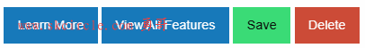
<!-- Anchors (links) -->
<a href="about.html" class="button">Learn More</a>
<a href="#features" class="button">View All Features</a>

<!-- Buttons (actions) -->
<button class="submit success button">Save</button>
<button type="button" class="alert button">Delete</button>
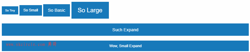
(2)改变按钮大小
<a class="button tiny" href="#">So Tiny</a>
<a class="button small" href="#">So Small</a>
<a class="button" href="#">So Basic</a>
<a class="button large" href="#">So Large</a>
<a class="button expanded" href="#">Such Expand</a>
<a class="button small expanded" href="#">Wow, Small Expand</a>
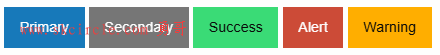
(3)按钮颜色
<a class="button primary" href="#">Primary</a>
<a class="button secondary" href="#">Secondary</a>
<a class="button success" href="#">Success</a>
<a class="button alert" href="#">Alert</a>
<a class="button warning" href="#">Warning</a>
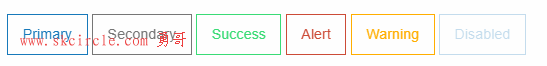
(4)中空透明
<button class="hollow button" href="#">Primary</button>
<button class="hollow button secondary" href="#">Secondary</button>
<button class="hollow button success" href="#">Success</button>
<button class="hollow button alert" href="#">Alert</button>
<button class="hollow button warning" href="#">Warning</button>
<button class="hollow button" href="#" disabled>Disabled</button>
(5)按钮禁用
<a class="button disabled" href="#" aria-disabled>Disabled</a>
<button type="button" class="button primary" disabled>Disabled</button>
<button type="button" class="button secondary" disabled>Disabled</button>
<button type="button" class="button success" disabled>Disabled</button>
<button type="button" class="button alert" disabled>Disabled</button>
<button type="button" class="button warning" disabled>Disabled</button>
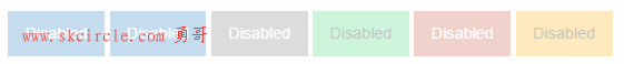
可以和中空透明属性连起来用
<a class="button hollow disabled" href="#" aria-disabled>Disabled</a>
<button type="button" class="button hollow primary" disabled>Disabled</button>
<button type="button" class="button hollow secondary" disabled>Disabled</button>
<button type="button" class="button hollow success" disabled>Disabled</button>
<button type="button" class="button hollow alert" disabled>Disabled</button>
<button type="button" class="button hollow warning" disabled>Disabled</button>
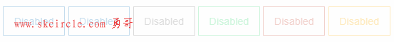
(6)不要填充
<a class="clear button" href="#">Primary</a>
<a class="clear button secondary" href="#">Secondary</a>
<a class="clear button success" href="#">Success</a>
<a class="clear button alert" href="#">Alert</a>
<a class="clear button warning" href="#">Warning</a>
<a class="clear button" href="#" disabled>Disabled</a>

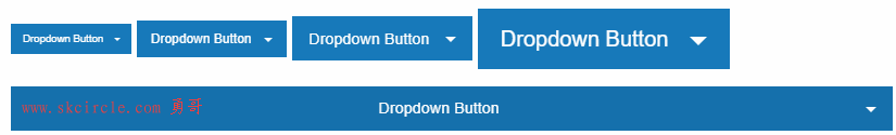
(7)下推箭头
<button class="dropdown button tiny">Dropdown Button</button>
<button class="dropdown button small">Dropdown Button</button>
<button class="dropdown button">Dropdown Button</button>
<button class="dropdown button large">Dropdown Button</button>
<button class="dropdown button expanded">Dropdown Button</button>
(8)不显示文字,只显示符号
    <button class="button" type="button">
        <!-- Screen readers will see "close" -->
        <span class="show-for-sr">Close</span>
        <!-- Visual users will see the X, but not the "Close" text -->
        <span aria-hidden="false"><i class="fi-x"></i></span>
    </button>
这里官方说对于visual用户可以看到一个叉

勇哥只看到一个空白按钮。

本文出自勇哥的网站《少有人走的路》wwww.skcircle.com,转载请注明出处!讨论可扫码加群:

本帖最后由 勇哥,很想停止 于 2024-05-20 20:22:49 编辑 
")
")
常用的6种方法")
 封装运动功能")
:运行时api的使用,vs环境下的联调")


")


