 少有人走的路
(一)基本样式
即使用Style属性来修饰元素的外观。
注意几点:
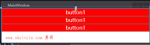
Stype如果不指定名字,则对全部按钮应用样式
注意StaticResource myclass, 而不是StaticResource.myclass,否则会报错
这个有点奇怪。
<Window x:Class="WpfApp1.MainWindow"
        xmlns="http://schemas.microsoft.com/winfx/2006/xaml/presentation"
        xmlns:x="http://schemas.microsoft.com/winfx/2006/xaml"
        xmlns:d="http://schemas.microsoft.com/expression/blend/2008"
        xmlns:mc="http://schemas.openxmlformats.org/markup-compatibility/2006"
        xmlns:local="clr-namespace:WpfApp1"
        mc:Ignorable="d"
        Title="MainWindow" Height="350" Width="525">
    <Window.Resources>
        <Style x:Key="myclass" TargetType="Button">
            <Setter Property="FontSize" Value="18"/>
            <Setter Property="Foreground" Value="White"/>
            <Setter Property="Background" Value="Red"/>
            <Setter Property="Content" Value="button1"/>
        </Style>
    </Window.Resources>
    <Grid>
        <Grid.RowDefinitions>
            <RowDefinition/>
        </Grid.RowDefinitions>
        <StackPanel>
            <Button Style="{StaticResource myclass}"/>
            <Button Style="{StaticResource myclass}"/>
            <Button Style="{StaticResource myclass}"/>
        </StackPanel>
    </Grid>
</Window>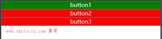
注意几点:
样子可以继承基类,用BaseOn属性
标签中的Content属性,优先于Styple中的Content
这就是所谓的属性就近有效原则
<Window x:Class="WpfApp1.MainWindow"
        xmlns="http://schemas.microsoft.com/winfx/2006/xaml/presentation"
        xmlns:x="http://schemas.microsoft.com/winfx/2006/xaml"
        xmlns:d="http://schemas.microsoft.com/expression/blend/2008"
        xmlns:mc="http://schemas.openxmlformats.org/markup-compatibility/2006"
        xmlns:local="clr-namespace:WpfApp1"
        mc:Ignorable="d"
        Title="MainWindow" Height="350" Width="525">
    <Window.Resources>

        <Style x:Key="buttonBase" TargetType="Button">
            <Setter Property="FontSize" Value="18"/>
            <Setter Property="Foreground" Value="White"/>
            <Setter Property="Background" Value="Red"/>
        </Style>

        <Style x:Key="myclass" TargetType="Button"  BasedOn="{StaticResource buttonBase}">
            <Setter Property="Content" Value="button1"/>
        </Style>
    </Window.Resources>
    <Grid>
        <Grid.RowDefinitions>
            <RowDefinition/>
        </Grid.RowDefinitions>
        <StackPanel>
            <Button Content="button1" Style="{StaticResource myclass}" Background="Green"/>
            <Button Content="button2" Style="{StaticResource myclass}"/>
            <Button Content="button3" Style="{StaticResource myclass}"/>
        </StackPanel>
    </Grid>
</Window>
(二)控件模板
一
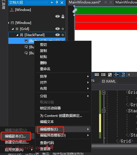
模板源码:
几点说明
(1)ContentPresenter 显示控件内容。凡是继承ContentControl的控件,都是由ContentPresenter 显示内容的
(2)
<Window x:Class="WpfApp1.MainWindow"
        xmlns="http://schemas.microsoft.com/winfx/2006/xaml/presentation"
        xmlns:x="http://schemas.microsoft.com/winfx/2006/xaml"
        xmlns:d="http://schemas.microsoft.com/expression/blend/2008"
        xmlns:mc="http://schemas.openxmlformats.org/markup-compatibility/2006"
        xmlns:local="clr-namespace:WpfApp1"
        mc:Ignorable="d"
        Title="MainWindow" Height="350" Width="525">
    <Window.Resources>

        <Style x:Key="buttonBase" TargetType="Button">
            <Setter Property="FontSize" Value="18"/>
            <Setter Property="Foreground" Value="White"/>
            <Setter Property="Background" Value="Red"/>
        </Style>

        <Style x:Key="myclass" TargetType="Button"  BasedOn="{StaticResource buttonBase}">
            <Setter Property="Content" Value="button1"/>
        </Style>
        <ControlTemplate x:Key="ButtonBaseControlTemplate1" TargetType="{x:Type ButtonBase}">
            <Border x:Name="border" BorderBrush="{TemplateBinding BorderBrush}" BorderThickness="{TemplateBinding BorderThickness}" Background="{TemplateBinding Background}" SnapsToDevicePixels="True">
                <ContentPresenter x:Name="contentPresenter"
                                  ContentTemplate="{TemplateBinding ContentTemplate}"
                                  Content="{TemplateBinding Content}"
                                  ContentStringFormat="{TemplateBinding ContentStringFormat}"
                                  Focusable="False"
                                  HorizontalAlignment="{TemplateBinding HorizontalContentAlignment}"
                                  Margin="{TemplateBinding Padding}"
                                  RecognizesAccessKey="True"
                                  SnapsToDevicePixels="{TemplateBinding SnapsToDevicePixels}"
                                  VerticalAlignment="{TemplateBinding VerticalContentAlignment}"/>
            </Border>
            <ControlTemplate.Triggers>
                <Trigger Property="Button.IsDefaulted" Value="True">
                    <Setter Property="BorderBrush" TargetName="border" Value="{DynamicResource {x:Static SystemColors.HighlightBrushKey}}"/>
                </Trigger>
                <Trigger Property="IsMouseOver" Value="True">
                    <Setter Property="Background" TargetName="border" Value="#FFBEE6FD"/>
                    <Setter Property="BorderBrush" TargetName="border" Value="#FF3C7FB1"/>
                </Trigger>
                <Trigger Property="IsPressed" Value="True">
                    <Setter Property="Background" TargetName="border" Value="#FFC4E5F6"/>
                    <Setter Property="BorderBrush" TargetName="border" Value="#FF2C628B"/>
                </Trigger>
                <Trigger Property="ToggleButton.IsChecked" Value="True">
                    <Setter Property="Background" TargetName="border" Value="#FFBCDDEE"/>
                    <Setter Property="BorderBrush" TargetName="border" Value="#FF245A83"/>
                </Trigger>
                <Trigger Property="IsEnabled" Value="False">
                    <Setter Property="Background" TargetName="border" Value="#FFF4F4F4"/>
                    <Setter Property="BorderBrush" TargetName="border" Value="#FFADB2B5"/>
                    <Setter Property="Foreground" Value="#FF838383"/>
                </Trigger>
            </ControlTemplate.Triggers>
        </ControlTemplate>
    </Window.Resources>
    <Grid>
        <Grid.RowDefinitions>
            <RowDefinition/>
        </Grid.RowDefinitions>
        <StackPanel>
            <Button Content="button1" Style="{StaticResource myclass}" Background="Green" Template="{DynamicResource ButtonBaseControlTemplate1}"/>
            <Button Content="button2" Style="{StaticResource myclass}"/>
            <Button Content="button3" Style="{StaticResource myclass}"/>
        </StackPanel>
    </Grid>
</Window>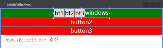
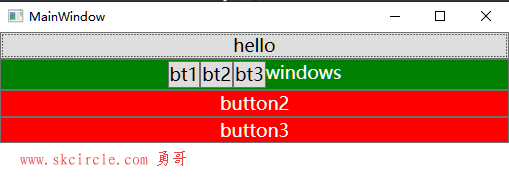
我们可以自定义按钮的Content,让它呈现复杂的内容,它们都是由ContentPresenter 来呈现内容。
   <Grid>
        <Grid.RowDefinitions>
            <RowDefinition/>
        </Grid.RowDefinitions>
        <StackPanel>
            <Button Style="{StaticResource myclass}" Background="Green"
                     Template="{DynamicResource ButtonBaseControlTemplate1}">
                <Button.Content>
                    <StackPanel Orientation="Horizontal">
                        <Button Content="bt1"/>
                        <Button Content="bt2"/>
                        <Button Content="bt3"/>
                        <TextBlock Text="windows"/>
                    </StackPanel>
                </Button.Content>
            </Button>
            <Button Content="button2" Style="{StaticResource myclass}"/>
            <Button Content="button3" Style="{StaticResource myclass}"/>
        </StackPanel>
    </Grid>
通过“可视化树”可以显示出控件模板的结构。
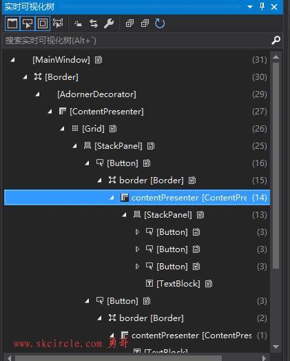
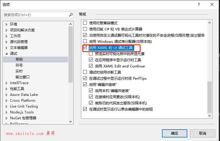
当程序运行时,会显示一个UI调试工具,它可以配合“可视化树”工作。
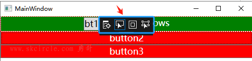
如果不希望在调试时显示这个调试工具,可以如下去掉勾选。
最后我们把第一个按钮拆成上下两个部分。
从这个操作你可以看到wpf对控件展示能力的强大和灵活性。
<Window x:Class="WpfApp1.MainWindow"
        xmlns="http://schemas.microsoft.com/winfx/2006/xaml/presentation"
        xmlns:x="http://schemas.microsoft.com/winfx/2006/xaml"
        xmlns:d="http://schemas.microsoft.com/expression/blend/2008"
        xmlns:mc="http://schemas.openxmlformats.org/markup-compatibility/2006"
        xmlns:local="clr-namespace:WpfApp1"
        mc:Ignorable="d"
        Title="MainWindow" Height="350" Width="525">
    <Window.Resources>

        <Style x:Key="buttonBase" TargetType="Button">
            <Setter Property="FontSize" Value="18"/>
            <Setter Property="Foreground" Value="White"/>
            <Setter Property="Background" Value="Red"/>
        </Style>

        <Style x:Key="myclass" TargetType="Button"  BasedOn="{StaticResource buttonBase}">
            <Setter Property="Content" Value="button1"/>

        </Style>
        <ControlTemplate x:Key="ButtonBaseControlTemplate1" TargetType="{x:Type ButtonBase}">
            <Grid>
                <Grid.RowDefinitions>
                    <RowDefinition Height="auto"/>
                    <RowDefinition/>
                </Grid.RowDefinitions>
                <Border Background="Red"/>
                <Button Content="hello"/>
                <Border Grid.Row="1" x:Name="border"
                    BorderBrush="{TemplateBinding BorderBrush}"
                    BorderThickness="{TemplateBinding BorderThickness}"
                    Background="{TemplateBinding Background}"
                    SnapsToDevicePixels="True">

                    <ContentPresenter x:Name="contentPresenter"

                                  ContentTemplate="{TemplateBinding ContentTemplate}"
                                  Content="{TemplateBinding Content}"
                                  ContentStringFormat="{TemplateBinding ContentStringFormat}"
                                  Focusable="False"
                                  HorizontalAlignment="{TemplateBinding HorizontalContentAlignment}"
                                  Margin="{TemplateBinding Padding}"
                                  RecognizesAccessKey="True"
                                  SnapsToDevicePixels="{TemplateBinding SnapsToDevicePixels}"
                                  VerticalAlignment="{TemplateBinding VerticalContentAlignment}"/>
                </Border>
            </Grid>

            <ControlTemplate.Triggers>
                <Trigger Property="Button.IsDefaulted" Value="True">
                    <Setter Property="BorderBrush" TargetName="border" Value="{DynamicResource {x:Static SystemColors.HighlightBrushKey}}"/>
                </Trigger>
                <Trigger Property="IsMouseOver" Value="True">
                    <Setter Property="Background" TargetName="border" Value="#FFBEE6FD"/>
                    <Setter Property="BorderBrush" TargetName="border" Value="#FF3C7FB1"/>
                </Trigger>
                <Trigger Property="IsPressed" Value="True">
                    <Setter Property="Background" TargetName="border" Value="#FFC4E5F6"/>
                    <Setter Property="BorderBrush" TargetName="border" Value="#FF2C628B"/>
                </Trigger>
                <Trigger Property="ToggleButton.IsChecked" Value="True">
                    <Setter Property="Background" TargetName="border" Value="#FFBCDDEE"/>
                    <Setter Property="BorderBrush" TargetName="border" Value="#FF245A83"/>
                </Trigger>
                <Trigger Property="IsEnabled" Value="False">
                    <Setter Property="Background" TargetName="border" Value="#FFF4F4F4"/>
                    <Setter Property="BorderBrush" TargetName="border" Value="#FFADB2B5"/>
                    <Setter Property="Foreground" Value="#FF838383"/>
                </Trigger>
            </ControlTemplate.Triggers>
        </ControlTemplate>
    </Window.Resources>
    <Grid>
        <Grid.RowDefinitions>
            <RowDefinition/>
        </Grid.RowDefinitions>
        <StackPanel>
            <Button Style="{StaticResource myclass}" Background="Green"
                     Template="{DynamicResource ButtonBaseControlTemplate1}">
                <Button.Content>
                    <StackPanel Orientation="Horizontal">
                        <Button Content="bt1"/>
                        <Button Content="bt2"/>
                        <Button Content="bt3"/>
                        <TextBlock Text="windows"/>
                    </StackPanel>
                </Button.Content>
            </Button>
            <Button Content="button2" Style="{StaticResource myclass}"/>
            <Button Content="button3" Style="{StaticResource myclass}"/>
        </StackPanel>
    </Grid>
</Window>本文出自勇哥的网站《少有人走的路》wwww.skcircle.com,转载请注明出处!讨论可扫码加群:

本帖最后由 勇哥,很想停止 于 2024-06-09 19:07:15 编辑 

")
")
常用的6种方法")
 封装运动功能")


:基础知识")


Qt Widgets Designer界面设计器和界面应用")
:if的bool判断, 变量的作用域范围, 格式字符串, 弹窗, 列表推导式, 一个点歌小程序")